Data Visualisation
Representation and Revelation - the power of data visualisation
Often when asked by people I meet what I do, after I say “data visualisation” or “visual analytics” I’m met with a blank expression. I generally follow this up with the somewhat facile explanation “I make pictures and graphs out of other people’s data” after which their response changes and they understand how I spend my professional time. Despite the massive growth in visual analytics and the data revolution over the last decade, few people know what data visualisation is or why it can be so impactful.
Surprisingly data visualisation has been around for quite some time, with possibly one of the earliest data visualisations – and one could argue most influential – being “Diagram of the causes of mortality in the army in the East” produced by none other than Florence Nightingale in 1858 as part of her report on the causes of deaths in the Crimean War (shown below).

Each chart represents a year, with each of the segments representing a month – the chart to the left being the period April 1854 – March 1885, and the chart to the left being the following year. The blue areas represent deaths caused by “Mitigable Zymotic” or preventable causes, the red areas deaths due to wounds, and the black due to other reasons. The smaller chart to the left shows the impact of the nursing corps intervention, greatly reducing the number of deaths via effective sanitation. While this wasn’t the only visualisation Florence Nightingale used in her reports (she was keen statistician & user of visualisations as well as mother to modern nursing) it was certainly impactful as it very effectively showed the effect of sanitary intervention, as well as the real killer to the army – preventable disease. Moreover, on her return to England, she used this illustration & the impact of sanitation on preventable diseases to argue with the British government that similar efforts should be applied to the civilian population.
To me this is also a very good example of one of the two key powers of good data visualisation – Representation. The second power of good data visualisation – Revelation – is exhibited by another early example created a few years earlier in 1854 by John Snow (no, not that one). John Snow was a physician from York investigating cholera and its means of communication. He had already written a paper arguing that cholera was not airborne but at that point was not sure of how it was being transmitted. When there was an outbreak in Soho, London in the Autumn of 1858 killing over 600 residents he conducted a survey amongst the local population and mapped the recorded incidences, producing the visualisation shown below. The black dots or stacks of dots representing reported cases.

This clearly demonstrated that the outbreak was clustered in an area, and it was discovered that all those infected had drawn water from a public water pump in Broad Street (circled in red). Upon further investigation John Snow realised that this water pump drew water from an area of the Thames where dirty clothes of cholera suffers had been washed, thereby infecting the water – this led him to hypothesize that water was the true vector of infection. Interestingly he also noticed that no reports of cholera had been reported by workers at the nearby brewery (with blue border). At the time brewery workers were allowed to drink beer they brewed as part of their compensation whilst working (it was weaker than modern beer!) and as the brewery had its own pump they avoided the contaminated water from Broad Street – and a similar story was evident for the work house north of Broad Street also with its own pump, which saw very few incidences despite having over 500 men billeted & working there.
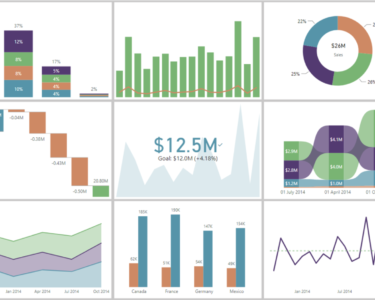
Representation: we’ve all heard the expression “A picture is worth a thousand words“, and how often have you looked at a spreadsheet or long list of numbers and not been able to spot any patterns or meaningful information? Our primary sense is that of sight, and so seeing information summarised in a visual manner – such as simple bars charts, or Florence Nightingales’ coxcomb charts above – that we can easily make sense of is highly powerful. Reducing large sets of data to a single image, or group of connected images can not only display patterns, trends & otherwise unknown facts but also greatly save time for those who need to understand what information their data holds. Also, as seen by the example of Florence Nightingale’s example it can be a highly effective communication tool, enabling the messenger to get their story across to the broader audience in an engaging, easily understood and more palatable form than impenetrable sets of numbers.
Revelation: as seen by John Snow’s cholera map, effective data visualisation can also illuminate previously unknown truths hidden in the data, or help validate hypotheses. And as such can be used not only as a reporting tool, but also as a proactive analytical tool uncovering previous unknown truths in otherwise impenetrable data. We experienced this form of Visual Analytics early on, back 2012 when we took open source data from NHS England and plotted specifically the prescribing of antibiotics across England by GPs. What we discovered as a consequence of plotting this data was that there were significant differences in how many antibiotics were being used by different CCG’s in England – particularly between Greater London in comparison to all other areas of England and between the North & South of England. As there shouldn’t be any significant regional differences in how bacterial infections spread this pointed to differences in GP’s attitudes & behaviour in respect to antibiotic use being the driver for the differences seen – and our data visualisation was featured by The Guardian newspaper as well as quoted by Dame Sally Davies in talks and articles regarding excessive antibiotic use.
Effective well-designed data visualisations & visual analytics can greatly help any organisation or project whereby communicating complex information is required. They can save time, engage the audience, and uncover otherwise hidden truths – all of which will help increase efficiency, improve communication and even help you discover crucial facts to help you achieve your strategic goals.
More Info: if you would like to learn more about our data visualisation and visual analytics services or how we could help you with a project please contact us
Related resources
-

Designing Dashboards for Mobile
An assessment of the leading data visualisation tools in respect to their out-of-the-box ability to provide dashboards for mobile use
-

Treatment Pathway Analysis
A unique visual analytics tool to enable interpretation of treatment choices across lines of therapy